

Formatting Your Book: Paragraphs and Sections
Formatting Your Book: Paragraphs and Sections


In my work as a book formatter, perhaps the simplest and most common mistake I see with self-publishers is to do with paragraphing. I don’t mean length – whether you favour paragraphs of multi-page-spanning Proustian prolixity, or single-line epigrams of Hemingwayesque brevity, it’s really no concern of mine. I may politely point out that, regarding dialogue, a new speaker needs a new one, but otherwise I recognise that the length of paragraphs is to an extent a matter of artistic taste and stylistic choice, and personal to each writer.
The mistake I most often see relates to indentation – that little space that pushes out the first line of a paragraph half an inch or so from the left margin. Here’s an example:

This is from the ebook version of Charlotte Brontë’s Jane Eyre on Project Gutenberg, the free public domain ebook site. As you can see, all the paragraphs are indented, including the first – which it shouldn’t be. For the correct way to do it, we can compare this with the Penguin Classics print edition (please excuse the awful quality of the photo, and those that follow!):
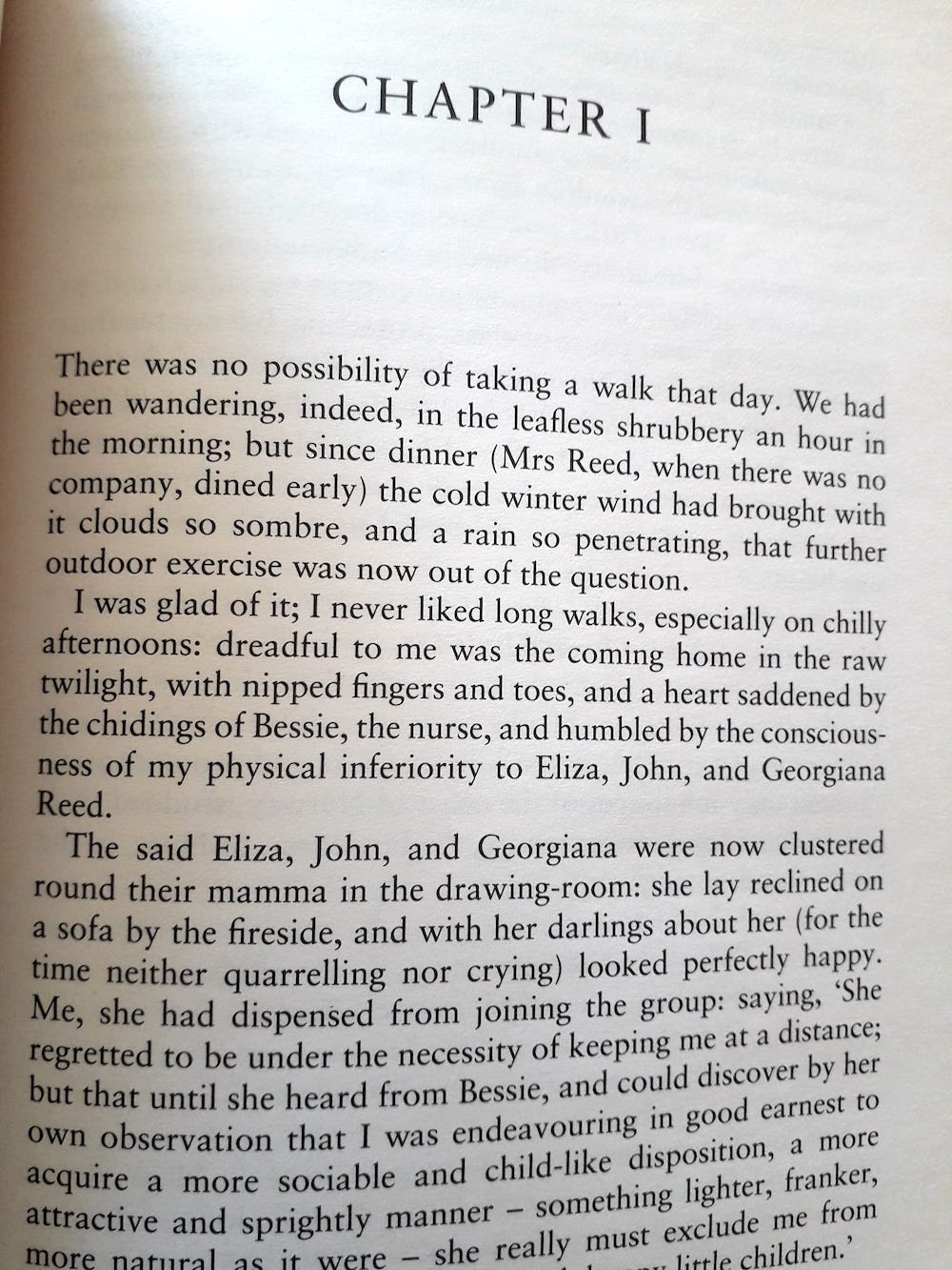
Here, the first paragraph has no indent, which is standard traditional publishing convention. By the way, this isn’t some technical restriction or stylistic difference specifically related to ebooks – there is no reason why the first line of a chapter in an ebook has to be indented. It’s just wrong.1
You’ll also notice that the text on the printed page is justified. Apart fom the left indent on the first line of paragraph two onward, you get nice square blocks of text. This is also as it should be. If you cast a glance at the page you’re currently reading, it is left aligned. This means that you get a neat left edge, but a “ragged” right edge. Here, paragraphs are indicated by line breaks/blank lines, rather than indented. This is quite a common practice with business writing and online media in general – see e.g. this from today’s Guardian:

There are various reasons for this choice, but the main one is that it allows for regular spacing between words.2 Since online text is often read at different sizes (in browers and apps, on phones, tablets or ereaders), then it also allows the text to reflow to fit the width of the screen without creating awkward gaps. But you rarely see this in printed books, which as I say are almost always justified – if you do see an exception, it’s probably a book where the paragraphs are often short or are frequently broken up by images, diagrams, etc. But for novels and most non-fiction, text is usually justified.
The other place where this mistake occurs is after a section break. These can occur in fiction or non-fiction, and are places where you want to indicate a change of scene or topic, the passage of time, or a change in viewpoint, without wanting to use a heading, sub-heading or start a new chapter. A section break can be indicated in two ways: by a separator (special characters or a decorative graphic), or a simple blank line. Here is a page from David Mitchell’s Cloud Atlas:

Notice that the paragraph that follows the blank line (“Over an hour later…”) is full out (to use the technical term). That is, it has no left indent.
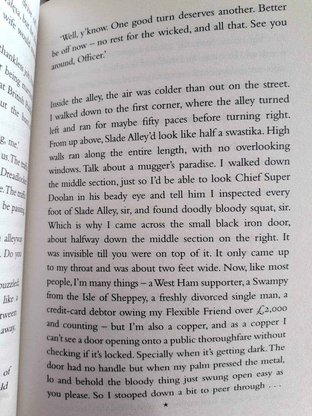
One thing to be aware of if you use the blank line method is that there will be sections in your print book that end near the bottom of the page. In such cases, it won’t be obvious to the reader that a section has ended and a new one is about to begin (they may not notice the lack of indent on the first paragraph of the following page), so standard practice is to put a scene separator in place of the blank line at the bottom of the page (or the top of the next), just for those occasions where the reader might otherwise not notice. For example, the following is from David Mitchell’s Slade House where you can see both methods at work on the same page (a blank line after “… Officer.” and a single asterisk/star at the very bottom of the page):
Obviously, this is only a consideration for the print book, as we have no way of knowing where an ebook “page” will end (because, strictly speaking, there are no pages in ebooks, just a constant stream of reflowable text).3 To avoid this ambiguity, you may want to prefer graphical scene separators over blank lines when formatting your ebook.
At the risk of confusing you, there are also other occasions where you might want to use both blank lines and graphical separtors in the same book. Here is another page from Cloud Atlas, taken from the same chapter:
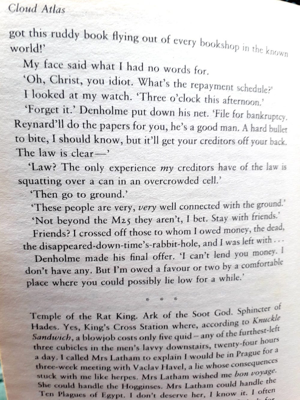
In using asterisks and blank lines, I think the purpose here was to create a sort of scene hierarchy. So, big changes of time, place, etc, are indicated by three asterisks, and smaller ones by blank lines. Or, if you wanted, you could have two sorts of separator – a simple line and a more ornate one, perhaps. It’s up to you.
Regarding the blank line option, another page from Slade House suggests you might prefer this method:

As one section ends with an ellipsis (. . .), the next begins with another one, suggesting that that the scene has changed (time or place), but there is still some connection – thought or action, theme or character – that links two. If Mitchell (or his pubisher) had used asterisks as a scene separator, then this woudn’t have worked so well.
By the way, the centred asterisks (sometimes three, sometimes one) are a common convention for scene separation in manuscript formatting, which you may already be familiar with, if you’ve ever submitted to agents. But you don’t have to stick to this in your published book, and it can also add a nice touch. Here’s a page from my own novel, MUNKi, where I’ve created a bespoke icon in the form of the head of a little monkey-like robot:

So, the choice is really up to you. But whatever you do, the main things to remember are:
Never indent the first line of a paragraph at the start of a chapter
Never indent the first line after a section break
Always start a new paragraph for each new speaker
Justify your text
Indent the first line of all other paragraphs
There might be special cases where you might bend or break some of these rules, but sticking by them will serve you best most of the time.
I could have made the title of this post “The One Simple Thing That Screams Out That Your Book is Self-Published” – but I resisted, because I hate clickbait. But it doesn’t mean it’s not true.
All Things Self-Publishing is a series of occasional articles that covers … all things self-publishing! Formatting your book, creating a cover, choosing a publishing platform, marketing and advertising, getting into libraries and bookshops – I share my free lessons, tips, mistakes and (mis)adventures from my years as a writer, professional illustrator and book designer. If you have a question, correction or suggestion, please leave a comment and I’ll respond.
Though I do note that most ebooks on Project Gutenberg seem to follow this mistake, so maybe it’s a consequence of the additional work that would be involved to format such a huge number of books correctly? A quirk of the software they use? No idea. You may also note that the spacing between paragraphs in Project Gutenberg’s ebook version of Jane Eyre is slighty greater than the space between indivdual lines within paragraphs, which is also not common formatting practice. When I have a spare minute, perhaps I’ll email them to find out…
We’ll come back to this another time, because justification word-spacing problems for printed books, but where there are established ways of dealing with them.
The exception to this is if your ebook has a “fixed” layout (as opposed to “reflowable”, which most ebooks have), but this mostly only applies to picture books, cookbooks, etc, where there are good reasons to make sure the text and images appear in a certain way together. I’ll cover fixed ebook layouts another time.